Notes
Best viewed in landscape on mobile. Unfortunately, the details that are available when hovering over the plotly plots do not seem to be available on mobile at the moment. Not really a 73 minute read.
Corrections
June 9: Corrected some errors with the x-axis scale in the plotly plots that were present when this was first posted
Age of World Cup Players
This is post two in a series using data for all World Cup teams collected in the first post
Here we will do a few visualizations around age.
Setup
# load libraries
library(tidyverse) # for data manipulation
library(lubridate) # to work with the birthdates
library(knitr) # for tables
library(plotly) # for interactive plots

# load data
all_squads <- read_csv("https://raw.githubusercontent.com/michaelpawlus/worldcup2018/squads/squads.csv")
How has the age of players changed over time?
# age of players by year
ggplot(all_squads, aes(x=Year, y=age)) +
  geom_jitter(alpha=0.2, color="#171714") +
  stat_summary(fun.y=mean, geom="line", size=1, color="#D30208") +
  stat_summary(fun.y=median, geom="line", size=1, color="#E5C685") +
  # note on mean line
  annotate("rect", xmin = 1928, xmax = 1932, ymin = 41, ymax = 43,
          color = "#D30208", fill = "#D30208") +
  annotate("text", x = 1934, y = 42, label = "average age", color="#171714", hjust = 0, size = 4) +
  # note on median line
  annotate("rect", xmin = 1928, xmax = 1932, ymin = 37, ymax = 39,
           color = "#E5C685", fill = "#E5C685") +
  annotate("text", x = 1934, y = 38, label = "median age", color="#171714", hjust = 0, size = 4) +
  theme(panel.background = element_blank(),
        panel.grid.major.y = element_line(color = "#171714", size = 0.25),
        legend.position="none",
        plot.title = element_text(hjust = 0.5)) +
  labs(x = "Year", y = "Age", title = "Age of World Cup Players")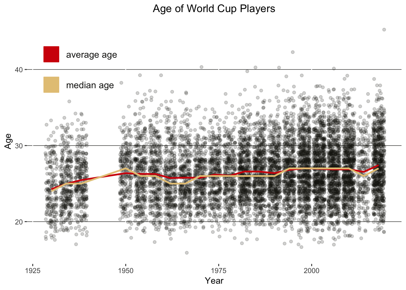
The ages of players have not changed much but there does seem to be an increase in the the number of players in their mid-30s.
## players 35+
all_squads %>%
  filter(age > 34) %>%
  group_by(Year) %>%
  summarize(`Players 35 and older` = n_distinct(Player)) %>%
  ungroup() %>%
  arrange(desc(Year)) %>%
  kable()
## Warning: The `printer` argument is deprecated as of rlang 0.3.0.
## This warning is displayed once per session.| Year | Players 35 and older |
|---|---|
| 2018 | 22 |
| 2014 | 3 |
| 2010 | 21 |
| 2006 | 21 |
| 2002 | 19 |
| 1998 | 19 |
| 1994 | 16 |
| 1990 | 7 |
| 1986 | 9 |
| 1982 | 8 |
| 1978 | 3 |
| 1974 | 1 |
| 1970 | 4 |
| 1966 | 7 |
| 1962 | 6 |
| 1958 | 7 |
| 1954 | 9 |
| 1950 | 2 |
| 1934 | 1 |
| 1930 | 1 |
Below, are all player ages by country. The red diamond is for the average team age and the gold diamond is for the median team age.
# make a subset of the data for 2018
wc18_age <- all_squads %>%
  filter(Year == 2018)

# get age expressed as number with 2 decimal places to avoid overlapping points
today <- today()
#elapsed.time <- wc18_age$dob %--% today  # the `%--%` causing issues
elapsed.time <- difftime(today, wc18_age$dob, units="days")/365.25

wc18_adj_age <- wc18_age %>%
  mutate(Country = fct_reorder(Country, desc(Country)), Pos = str_extract(Pos,"[:alpha:]+"), adj_age = elapsed.time)

# make the ggplot
wc18_adj_age_plot <- ggplot(wc18_adj_age, aes(Country, adj_age)) +
  geom_point(color = "#015386") +
  stat_summary(fun.y = min, colour = "#D30208", geom = "point", size = 3, shape=21, show.legend = TRUE) +
  stat_summary(fun.y = max, colour = "#E5C685", geom = "point", size = 3, shape=21, show.legend = TRUE) +
  stat_summary(fun.y = mean, colour = "#D30208", geom = "point", size = 3, shape=23, show.legend = TRUE) +
  stat_summary(fun.y = median, colour = "#E5C685", geom = "point", size = 3, shape=23, show.legend = TRUE) +
  coord_flip() +
  theme(text = element_text(color = "#171714"),
        panel.background = element_blank(),
        panel.grid.major.x = element_line(color = "#171714", size = 0.15),
        legend.position="none",
        axis.title = element_blank(),
        plot.title = element_text(hjust = 0.5)) +
  labs(title = "Ages for World Cup 2018 Teams")

# convert to plotly
wc18_adj_age_plot <- ggplotly(wc18_adj_age_plot)

# add more to the details available on hover
text_vec <- paste0("Country: ",wc18_adj_age$Country,"<br />Name: ",wc18_adj_age$Player,"<br />Position: ",wc18_adj_age$Pos,"<br />Age: ",round(wc18_adj_age$adj_age,2))

wc18_adj_age_plot$x$data[1][[1]][[3]] <- text_vec

# view plot
wc18_adj_age_plot- Sweden’s Emil Krafth is the oldest youngest player at 23.87 years
- South Korea’s Lee Yong is the youngest oldest player at 31.48 years
- Australia’s Daniel Arzani is the youngest player this year at 19.44 while Egypt’s Essam El-Hadary is the oldest player to ever compete at a World Cup
- Nigeria has the lowest average age: 25.97
- Mexico has the largest average age: 29.37
The plot below is the same as above except by Position instead Country:
wc18_adj_age <- wc18_adj_age %>%
  mutate(Pos = fct_relevel(Pos, "GK","DF","MF","FW"))

wc18_adj_age_plot <- ggplot(wc18_adj_age, aes(Pos, adj_age)) +
  geom_point(color = "#015386") +
  stat_summary(fun.y = min, colour = "#D30208", geom = "point", size = 3, shape=21, show.legend = TRUE) +
  stat_summary(fun.y = max, colour = "#E5C685", geom = "point", size = 3, shape=21, show.legend = TRUE) +
  stat_summary(fun.y = mean, colour = "#D30208", geom = "point", size = 3, shape=23, show.legend = TRUE) +
  stat_summary(fun.y = median, colour = "#E5C685", geom = "point", size = 3, shape=23, show.legend = TRUE) +
  coord_flip() +
  theme(text = element_text(color = "#171714"),
        panel.background = element_blank(),
        panel.grid.major.x = element_line(color = "#171714", size = 0.15),
        legend.position="none",
        axis.title = element_blank(),
        plot.title = element_text(hjust = 0.5)) +
  labs(title = "Ages for World Cup 2018 Players by Position")

wc18_adj_age_plot <- ggplotly(wc18_adj_age_plot)
## Don't know how to automatically pick scale for object of type difftime. Defaulting to continuous.text_vec <- paste0("Country: ",wc18_adj_age$Country,"<br />Name: ",wc18_adj_age$Player,"<br />Position: ",wc18_adj_age$Pos,"<br />Age: ",round(wc18_adj_age$adj_age,2))
wc18_adj_age_plot$x$data[1][[1]][[3]] <- text_vec
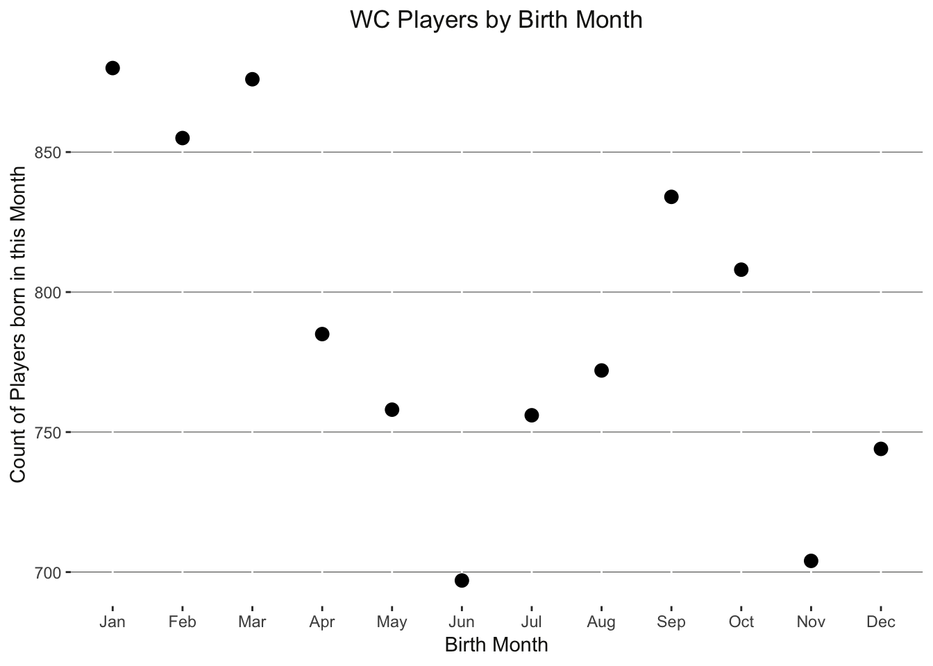
wc18_adj_age_plotLast look at age is to see if it matters when a player was born. I first heard of this idea from Malcolm Gladwell. Due to arbitrary cut-off dates for youth programs, those born in certain months end up being up to eleven months older than others which at a very young age is a significant developmental advantage. Gladwell shoes this with hockey where there is a greater share of professionals born in the first three months of the year then those born later on and to a certain extent we see the same results here:
all_squads %>%
  filter(!is.na(month), !is.na(birth_month)) %>%
  mutate(month_abbr = month(birth_month, label = TRUE, abbr = TRUE)) %>%
  group_by(month_abbr, birth_month) %>%
  tally() %>%
  arrange(birth_month) %>%
  ggplot(aes(x = month_abbr, y = n)) +
  geom_point(size = 3) +
  theme(text = element_text(color = "#171714"),
        panel.background = element_blank(),
        panel.grid.major.y = element_line(color = "#171714", size = 0.15),
        legend.position="none",
        plot.title = element_text(hjust = 0.5)) +
  labs(x = "Birth Month", y = "Count of Players born in this Month", title = "WC Players by Birth Month")